
NGAN // MAGIC + MEDICINE
Magic and Medicine is a quote given about the book, “Women Who Run With the Wolves” by Clarissa Pinkola. It resonates with Ngan’s belief that the feminine is divine and powerful. We are healers. Right now, Magic and Medicine offer lactation counseling services to breastfeeding families and will hopefully expand and also offer bereavement support to those who experienced miscarriages as a death midwife. She’s certified but her approach is very intuitive and holistic. She uses healing modalities that hold spiritual and ancient wisdom from my lineage and beyond.
NYC // NEW JERSEYServices
Brand Development
Illustration
Logo Identity

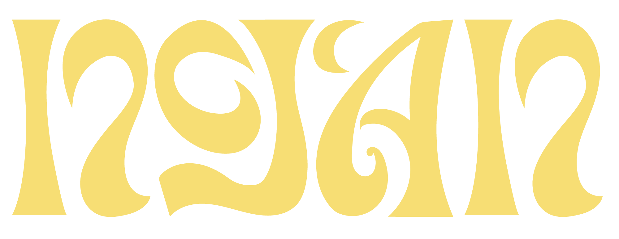
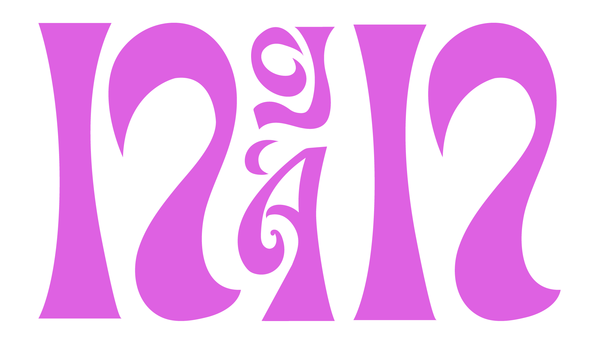
Ngân in Vietnamese it means to vibrate or resound like music. Her business offers services which include singing, songwriting, and collaborations.


The logo mark created for her brand was one of many I created for Ngan. This specific logo she chose, was inspired by the Om symbol. I created this mark by manipulating the symbol by using its sharp points/edges and creating the letters with those details. Because she sings I wanted to create letters that would flow together as well as be symmetrical. The accent mark above her name I would change to a moon which would also represent the deepness and love in her music.
Color


This is a tempory color set that me and Ngan decided on. We’re still in the process of nailing this down. Though, she’s a big fan of emerald green, purple/pink and yellow. 


For the branding of her other business, “Magic + Medicine” I wanted to create something that had a bohemian style, something magical and dreaming looking. Because this brand targets midwife who experiences miscarriages I want to have a women figure holding her stomach with love, along with a crescent moon and stars to represent the “Magic” and peace. The font I chose was a bohemians style font that gives this logomark a more dreamy feminine vibe.