
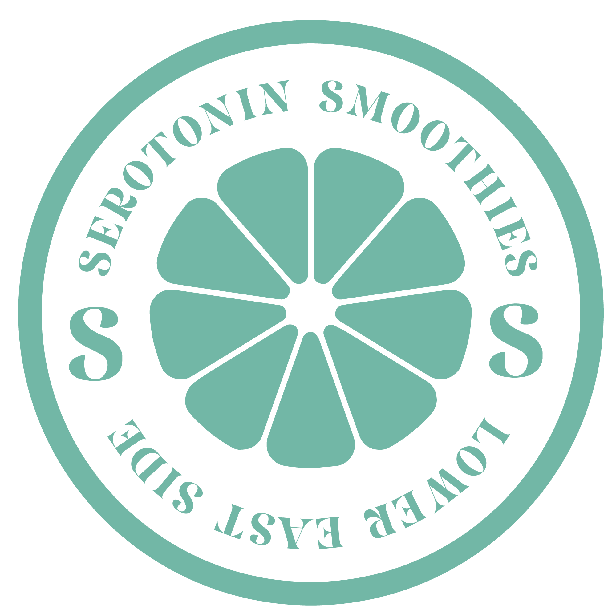
Serotonin NYC
Serotonin is a beverage shop that brings health and wellness to the Lower East Side community in New York City. It offers smoothies that are unique and flavorful. Each smoothie on the menu is created carefully and contains nutrients and vitamins that are essential. the brand is named “Serotonin” because it’s the happy hormone.
Lower East Side, New York CityServices
Branding & Identity
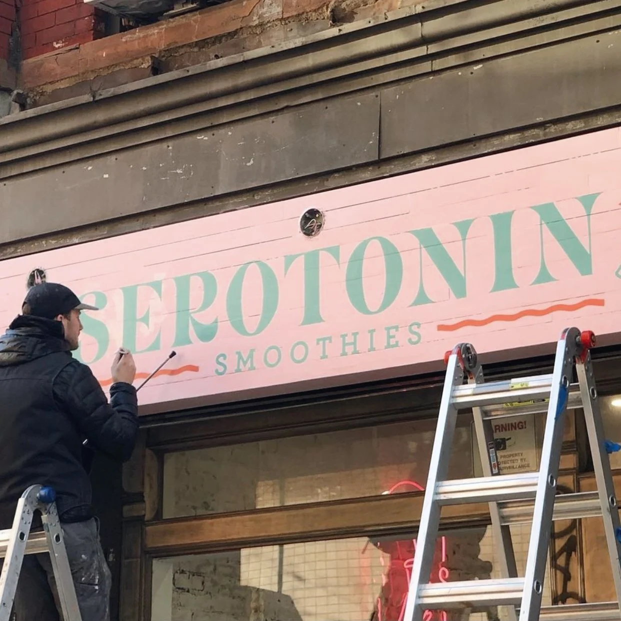
Logo Development
Illustration
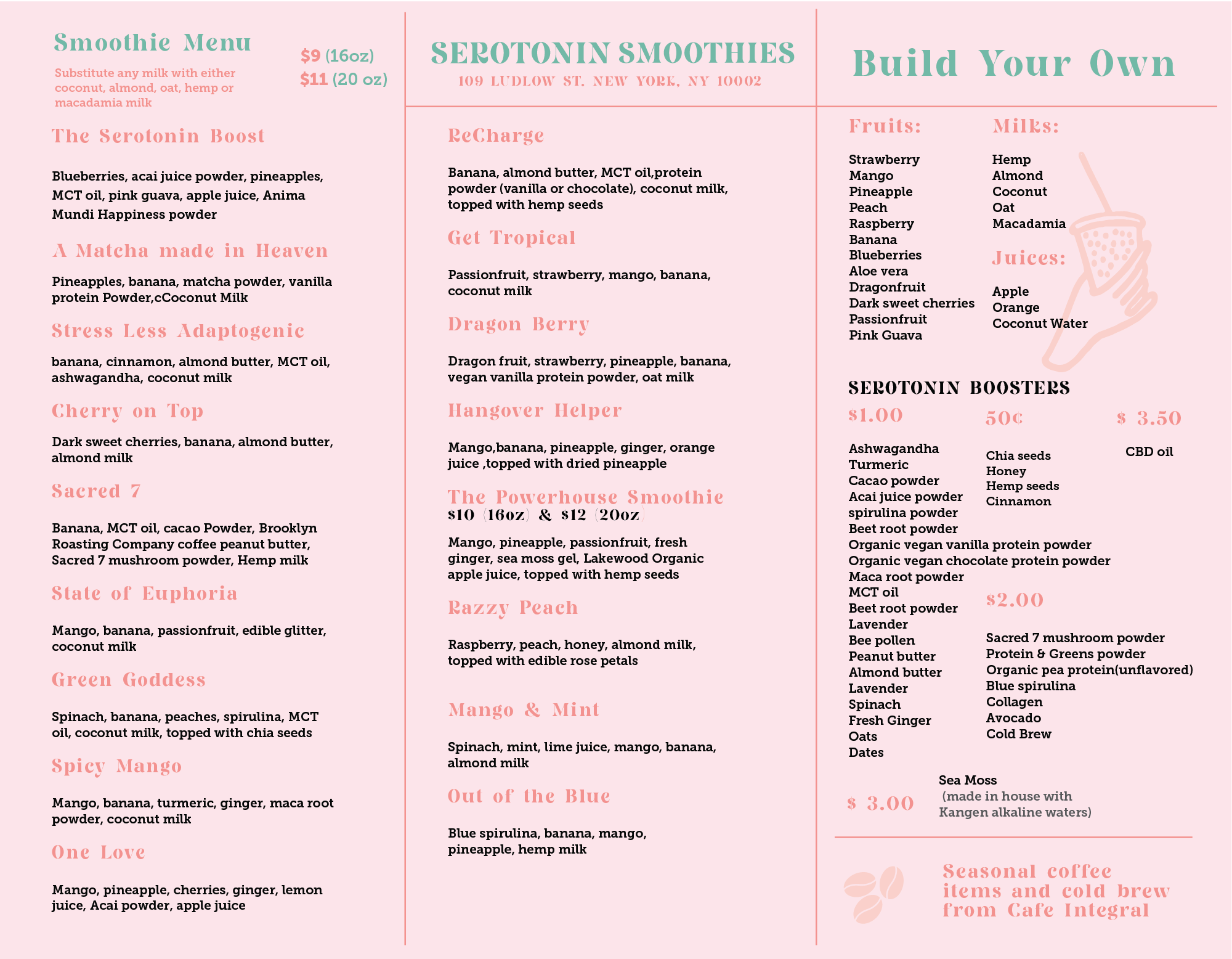
Menu Design


Color
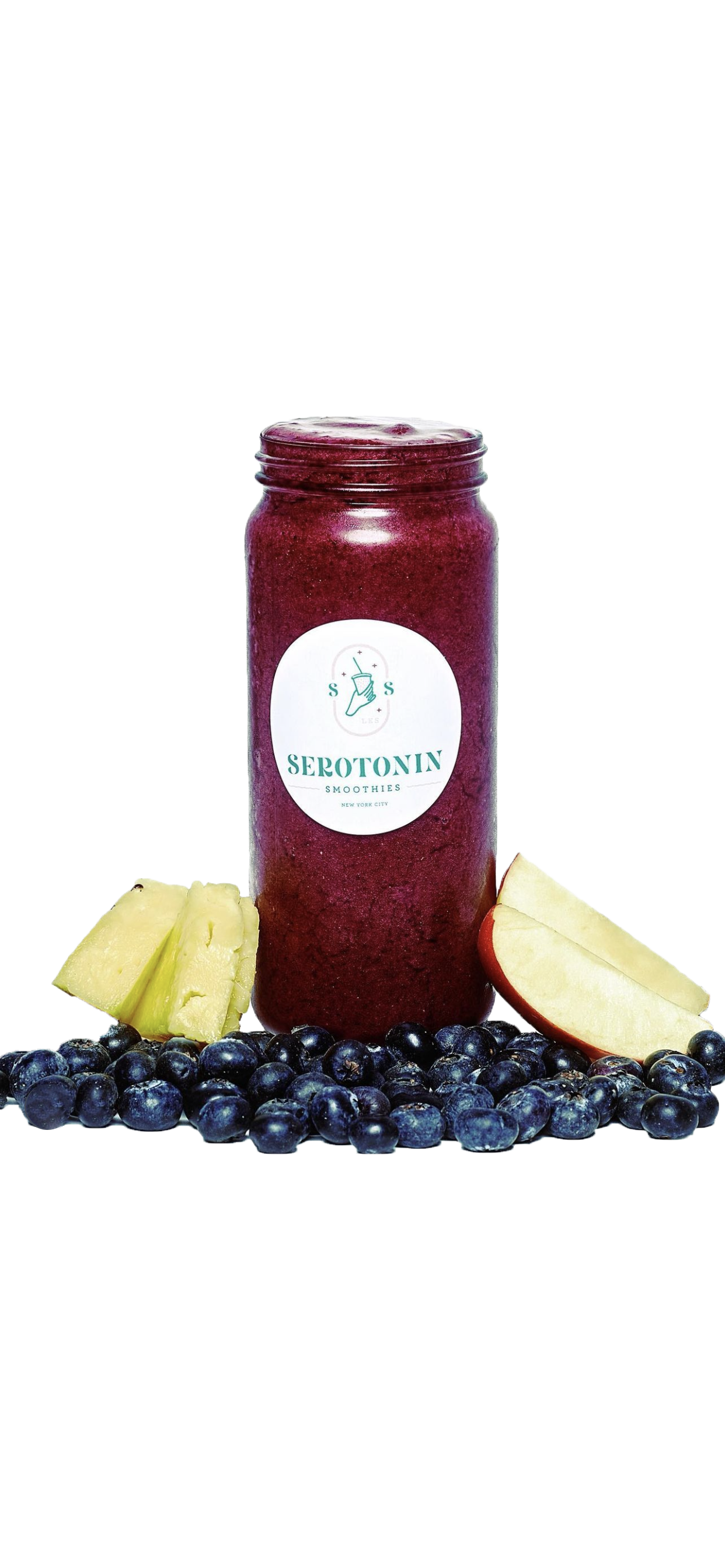
In order to truly communicate these sweet tasty smoothies I created this color pallet that would match the drinks and flavors of this brand. I wanted these colors to feel good and fresh just like the fruits used here. Pastels pinks, lavender, rich matcha greens, and fresh aqua blues. 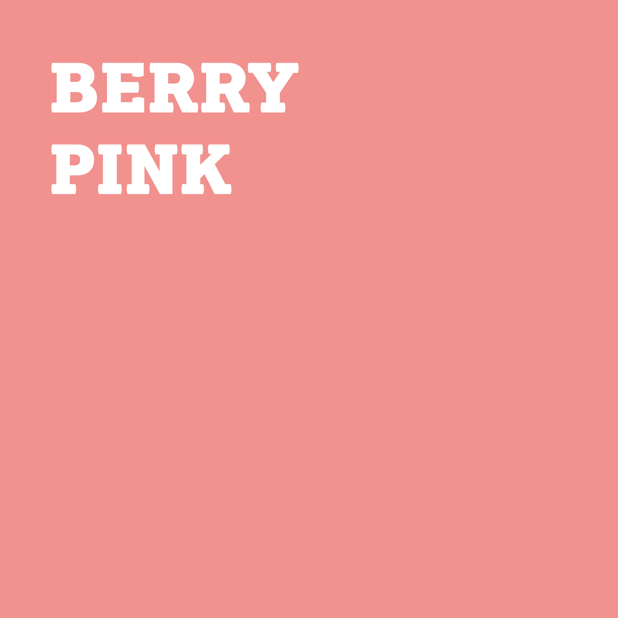


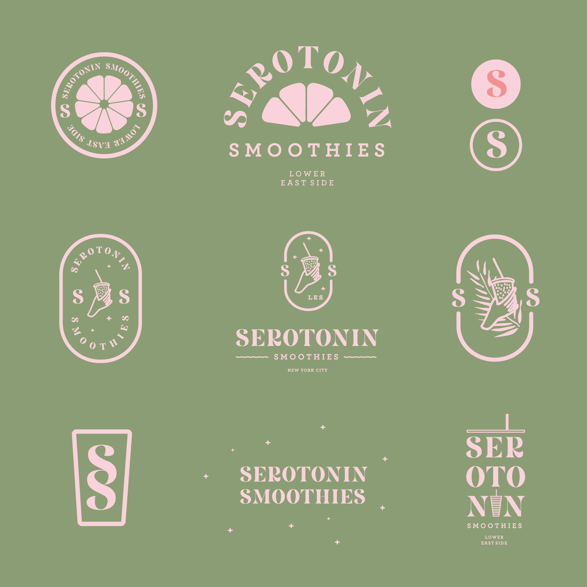
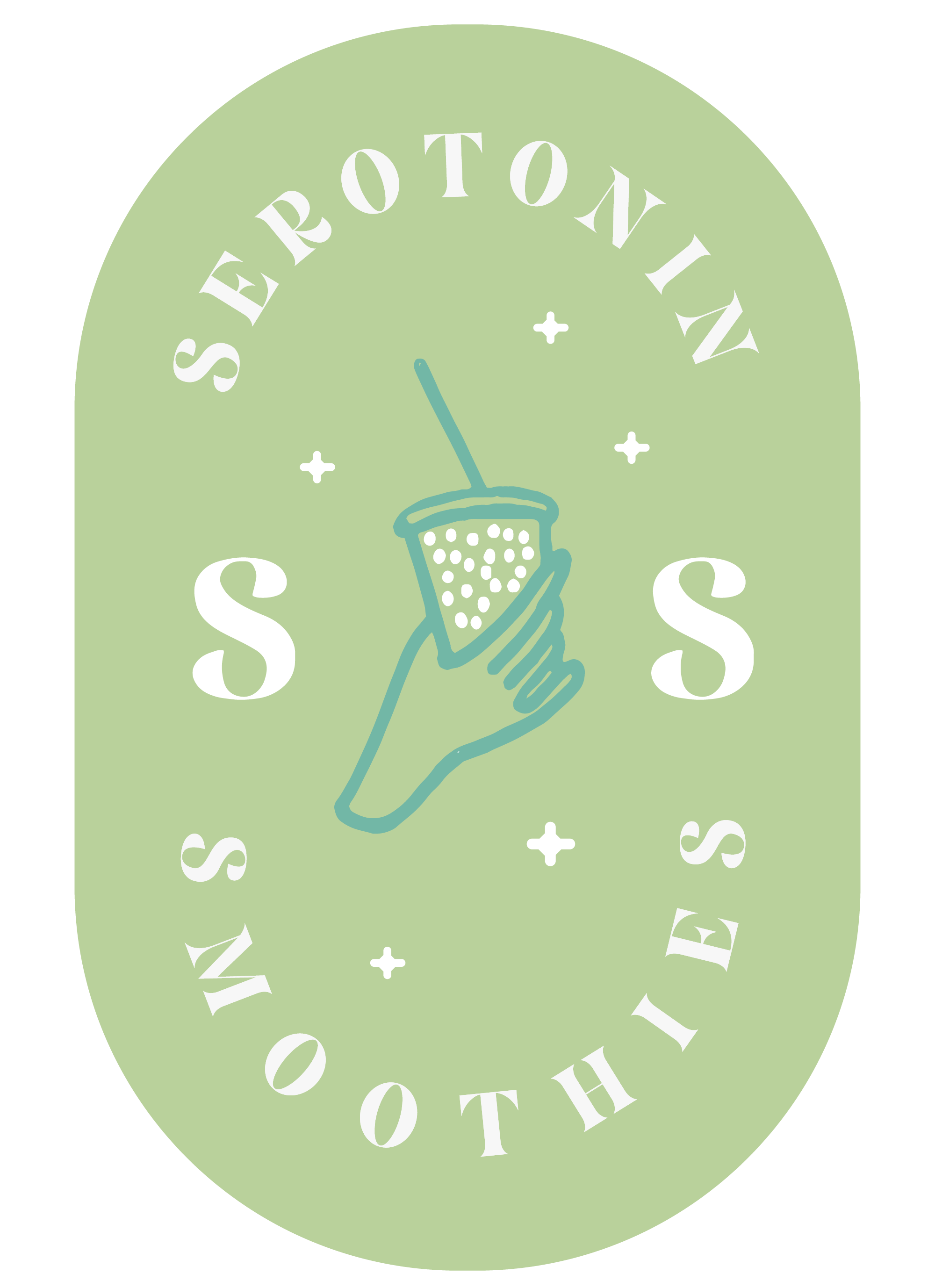
Logomark Color Variations


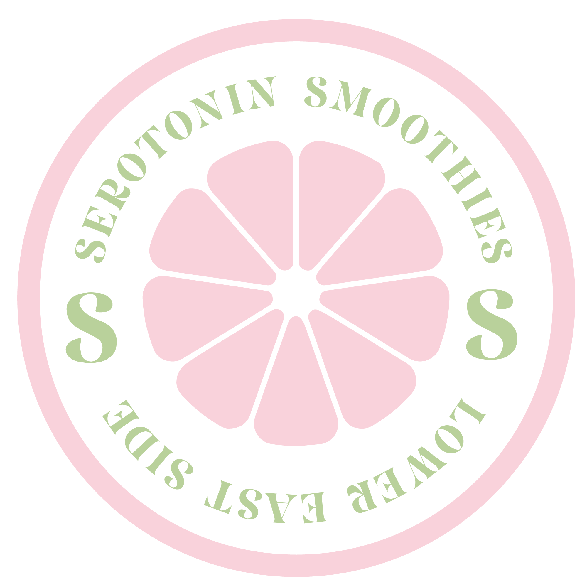


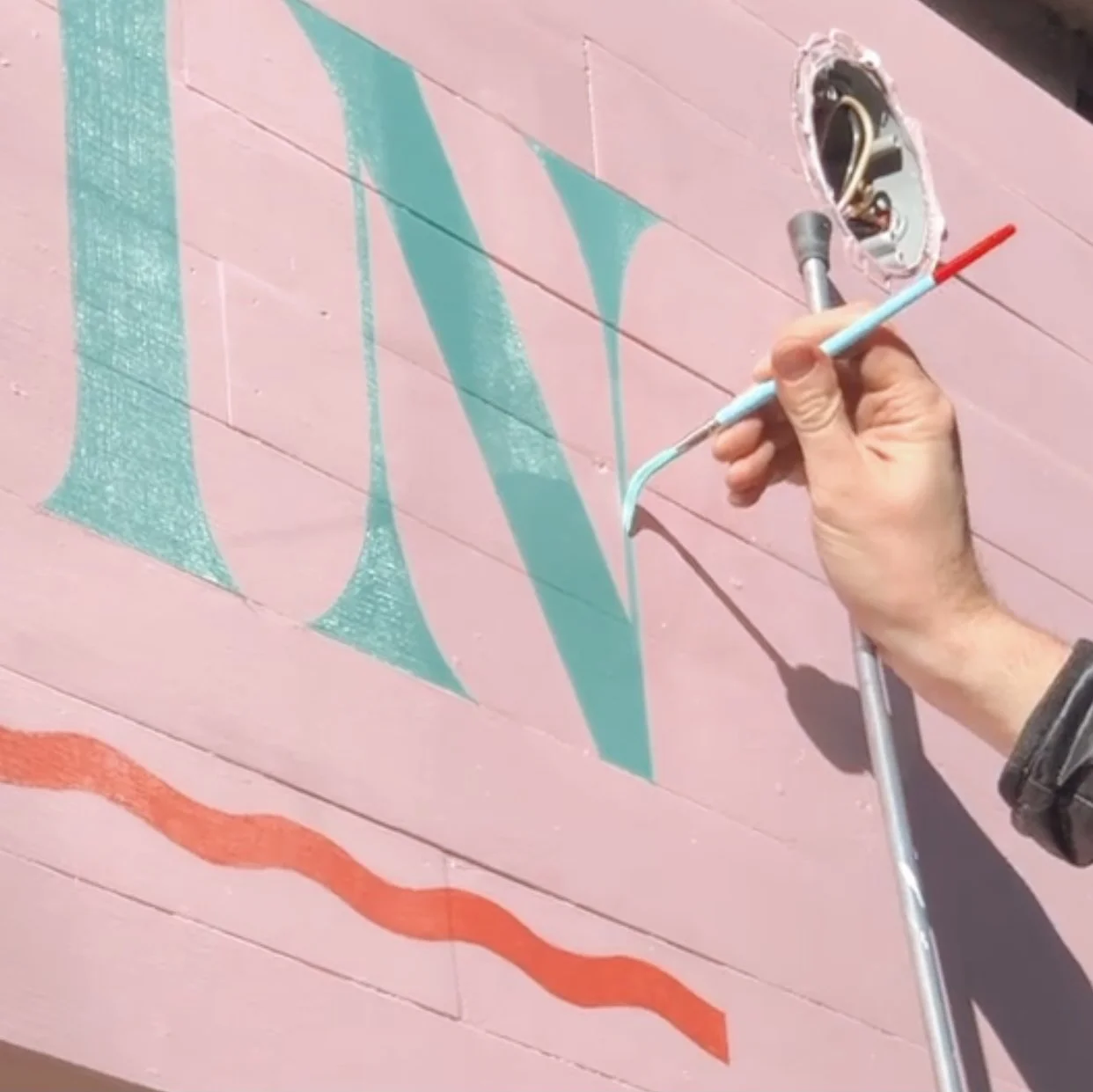
This alternate logo mark is inspired by the brownstones and apartment buildings in the surrounding area of the Lower East Side (LES). I realized since there was 9 letters in Serotonin I was able to make it symmetrical and create a building so I created a the “brownstone and made the stairs a smoothie to represent the brand.


More logomark color variations